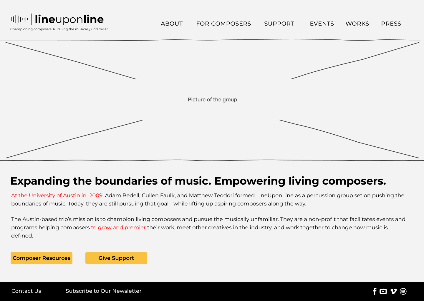

Line Upon Line Website Redesign
Responsive Redesign | UX Writing | Information Architecture
Line Upon Line (LuL) has been transitioning from a percussion band to a non-profit focused on supporting composers and pushing the boundaries of music. In the shift, the group has struggled to update their website in a way that reflects their new purpose, and users are confused about what LuL has to offer.
Our goal was to help revamp LuL's site and content to help them reach composers and increase support from their community.
The Challenge
In the existing site, Line Upon Line’s mission isn't clear, and users don't understand they’re a non-profit. Because of this, composers don't know what resources are available to them, and potential supporters aren’t donating.
How might we redesign Line Upon Line's website to make it clear what their mission and purpose are, and help connect them to both composers and supporters?
The Solution & Impact
Redesign the site navigation and enhance the content to give users more context and a more straightforward path to find information and resources.
After our redesign, users clearly understood Line Upon Line's mission and offerings. With the new design and organization, composers are empowered to access available resources, and supporters are encouraged to donate.
My Role: UX Designer & UX Writer
Timeline: 4 weeks
Team: Heather, April, Julia, Beverly, and myself
Tools Used: Figma, Miro, Trello, Invision
Our Design Process
Initial Analysis
To understand the issues that people were having with Line Upon Line's current site, we started our process with usability testing of the current site. We asked users to go through a series of tasks on the site to to understand what challenges they encountered.
Key Findings from Testing:
People didn’t understand Line Upon Line's purpose or they are a non-profit
Overall, pages were lacking context and important details to help users understand LuL's mission and offerings
People liked the look and feel of the current site (sleek, modern, black and yellow)

Understanding Our User Personas
Based on our research, there were two main personas who would use LuLs site - Composers and Supporters.
We laid out a persona for a composer and for a supporter - writing out our personas' goals and pain points helped us better understand how and why they would use LuL's site. We found that Composers were primarily visiting the site to find resources and see what programs are available to them, and Supporters were looking to either make a donation or buy a ticket to an event.

Laying out our personas' current state journeys helped us identify how they navigate LuL's site today and where they are encountering issues or frustrations:

To envision what our personas' future state might look like, we laid out our ideas in a storyboard:

Designing the Future State
Considering the goals of our personas, we brainstormed ideas and narrowed down our scope to three key features to focus on using a prioritization matrix.
We decided to focus on:
Enabling online donation
Clearly defining LuL's mission and offerings
Highlighting composers

To make it easier for people to find the what they're looking for, we did a card sort to logically group the site information. We renamed categories to be more user-friendly for people both inside and outside of the music community.
The structure of the card sort laid the groundwork for the structure of our site, which we laid out in a site map.

Through user testing our mobile and desktop low-fi prototypes, we got insight into how our users were feeling about the new navigation and design:
Key Takeaways:
Navigation was simple and easy to use
Site copy was too dense, but still didn’t have the detail users were looking for
Taking this feedback into our mid-fi, we focused on breaking up text and continuing to edit and simplify site copy.
Wireframing & Prototyping


With 5 people building the prototype, we wanted to make sure our site design was consistent. We created a style tile and style guide to make sure we set standards and built common components that would be used across the site.

Final Results
After our last round of usability testing, the feedback we got from our users was that the site was easy to navigate, content was understandable, and best of all, they clearly understood LuL’s mission and goals.


Lessons Learned
With a large group and a short timeframe, we learned a lot that we can take forward into future projects:
Make sure testing scope covers all pages, not just those in the main user flow
Establish spacing/padding standards early on for better consistency and less rework
At the beginning of the project, take time to talk about each person's working style to understand what to expect from each other